Visual proof up front
The work/gallery emphasis gives visitors immediate confidence before they read through details.
A gallery-led refresh for a barber and studio brand that needed to look the part and be easy to book from a phone.
Visit ZootyTheBarber.com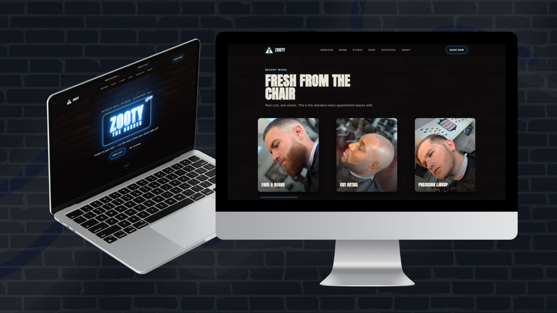
Look Good Feel Good Studio needed a site that felt like a real local brand instead of a generic service page. The rebuild put the work itself first, tightened the messaging, and made the booking path easier to spot.
The design leans into a bold, dark, neon-accented aesthetic while keeping the actual user journey simple: see proof, understand the brand, and know how to book.
Strong hero, brand tone, service proof
Visual examples and trust-building
Clear appointment direction
Connected apparel/studio presence
The work/gallery emphasis gives visitors immediate confidence before they read through details.
Navigation and calls to action are aimed at reducing friction between interest and appointment inquiry.
The design keeps the darker neon/studio feel without letting the effect overpower readability.
The site supports adjacent brand links and identity pieces without cluttering the core service path.
Send us what you have now and what feels off. We’ll give you a direct recommendation and a build direction that fits the goal.
Start an inquiry →